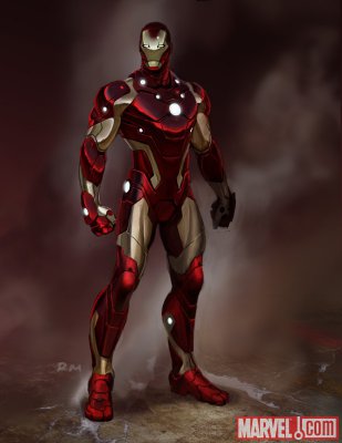
Marvel Unleashes Iron Man’s New Armor
Marvel has released an image of the new look Iron Man armor that Tony Stark will be wearing after the conclusion of the ‘Stark Disassembled‘ storyline. The new suit is designed by current Invincible Iron Man writer Matt Fraction, and Ryan Meinerding, who is a designer for the Iron Man and Thor Films.
Check it out below, along with the full press release:
Marvel is proud to unveil a new look for Iron Man, signaling a new era for Tony Stark and the Marvel Universe! From the minds of Eisner Award-winning series writer Matt Fraction and Ryan Meinerding, designer on the Iron Man and Thor films, comes the most bleeding edge, out of this world armor you’ve ever seen! Following the sold-out “Stark Disassembled” storyline, the Marvel Universe still needs its armored champion and a new mission requires a new kind of armor! But when you see just what Iron Man has planned for the Marvel Universe, your jaw will be on the floor! There’s never been a super hero like the new Iron Man!
“The inspiration for the new design came from thinking about a sleeker, leaner, tougher Iron Man,” revealed Fraction. “If technology is increasingly getting smaller and lighter it seems like the Iron Man should do the same: ergonomic and aerodynamic. We were looking for something that felt as sleek and glossy as a sports car Tony Stark would covet. I love what we’ve come up with. It feels like the next evolutionary step in the Iron Man’s design.”
A bold new direction for Iron Man starts here with the perfect jumping on point for readers old and new alike, as the all-new Iron Man makes his debut in Invincible Iron Man #25, on-sale this April!
Related posts:
- Invincible Iron Man #21: ‘Stark Disasselmbled Part Two’ Sells Out With No Plans for a Reprint
- A Three-Page Sneak Peek Preview of Invincible Iron Man #20
- ‘Stark: Disassembled’ Teaser Image
- The First Iron Man 2 Poster! Featuring the First Peek at the New War Machine Armor!
- Marvel Announces a New Ongoing Iron Man Series, Iron Man: Legacy


Okay, nice enough design except for all the spots. Did somebody shake Wite-Out over the picture? Less is more, y’know?